I wonder if I put a few words here?

Author: ashen (Page 2 of 2)

The Second Blog-My Experience with Multimedia Learning Principle

I have the experience of breaking the redundancy principle most of the time. When I was a high school student, I often copied the teacher’s notes on the blackboard or the screen by handwriting without listening to the content of the lecture. The positive effect of copying notes varies. Sometimes I could understand the content by looking up my notes. However, other times I could hardly understand the content of this course.

this cat shows me the scene when I was looking back at notes I have copied from the class, which feels confused in front of unfamiliar words
(source: pixabay)

In addition, I used to follow the signalling principle intrinsically. I would highlight the essential information with colour pens when a course has assigned textbooks or printed materials, and this method has helped me understand the theme of this class efficiently. However, some instructors would not assign printed materials but rather presented PowerPoint slides or used verbal instruction, so I have to write as many notes as I can, then I was breaking the redundancy principle.
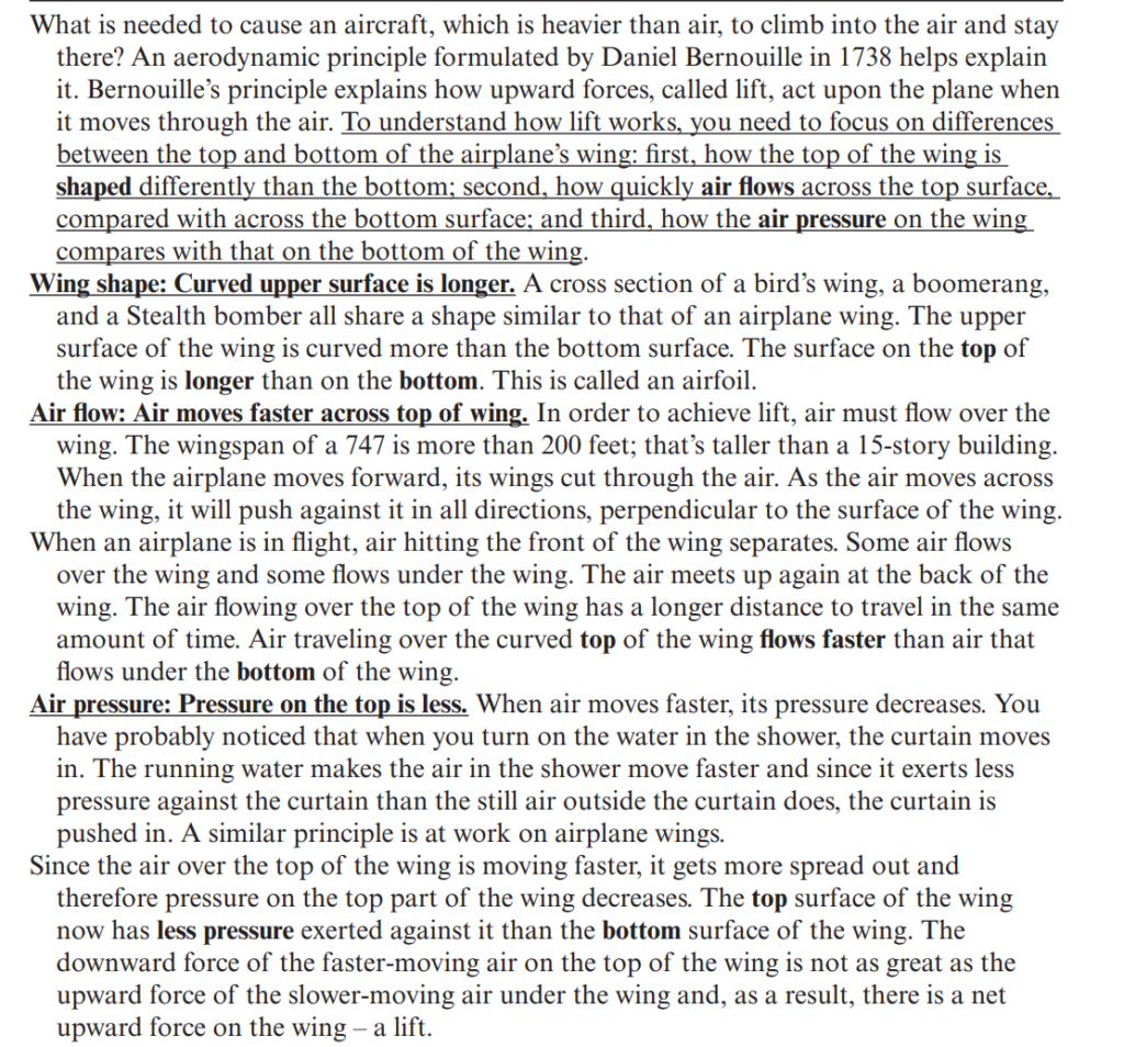
The way I highlight texts is followed by the table of the Principles for Reducing Extraneous Processing in Multimedia Learning: Coherence, Signaling, Redundancy, Spatial Contiguity, and Temporal Contiguity Principles , written by Richard E. Mayer and Logan Fiorella. I find this table really insightful to me.

As I look back at what I have done using these principles, the current challenge I have to overcome is reducing extraneous load. When I was recalling the way I copied the notes from the blackboard, I felt ridiculous for myself. Now I’m trying to write down the main texts in every lecture. Even though I cannot take every essential text during the lecture, at least this method helps me learn more efficiently.
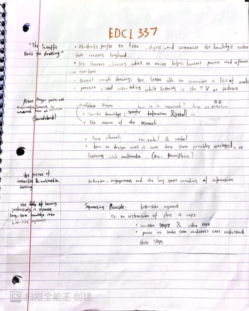
This is my recent notes that follows the redundancy principle

blog post#2: comments to my group members

For Amelia

Hi Amelia. I’m glad to hear you enjoy creating sketchnotes during your class! And I agree with you of pointing out the main information with images while make sketchnotes after I have read your sketchnote from your post. Besides, your organizion of texts and drawings is pretty clear.

Week 1 blog feedback for Celia

Hi Celia,

Your comment about applying interactive communication to marketing is very brilliant. According to your blog, you have mentioned adequate marketing communication information in subway stations while mentioning a few information about digital marketing.


However, I suggest you provide further information on subway advertisements. For example, you could explain why digital advertisements are more effective than traditional advertisements.

Besides, I just discovered my example of the McDonald temperature-sensitive panel has slight similarities fit to your blog theme. This panel that I have mentioned on my blog seems like a marketing strategy by McDonald’s company.

I wonder if you can insert a link to a specific phrase (example above) in your future blogs, so that readers would receive information more effectively.

Introduction to Interactive and Multimedia Learning

Photoed by Romeo A on unsplash

About why I choose this course

Firstly, my learning goal for this term is to learn strategies for applying multimedia in my future career. I realize multimedia has covered around my life in the present day, so I’m wondering using multimedia as the medium of an artwork would be attractive. Besides, multimedia is becoming popular in fine art. 

Secondly, I was thinking this course would teach me more efficient learning skills. The reason is that I believe I’m a visual learner, but I don’t know how to organize visual messages. 

provided by Pixabay

Defining “interactive”

Whether it is interactive media or interactive multimedia, the focus is still on the word “interactive”. This word sounds like one object creates one message, and audiences can attend to the same message from that object. 

JCDecaux creates a McDonald temperature-sensitive panel is a great example of sharing the same message to audiences. JCDecaux applies a temperature counter compared with other traditional advertisements, which focus on the format of images and words. The temperature counter is not only close to audiences’ real lives, but also a good chance to interact with audiences. 

mmm
the traditional advertisement is categorized as multimedia because it contains images and words (provided by Pixabay)

Technology is the mandatory element for interactive multimedia. However, involving technology may not become multimedia into interactive multimedia. Taking an example of a 3D animation on the street. This animation uses 3D effects of making plants grow and letting blossoms flowing. Also, it is a great idea to locate this animation in the downtown, but the effect of interaction is not very strong. Audiences might not feel the effect in-person.

Reference

JCDecaux (2015, July 7). McDonald’s temperature sensitive panel gives out free McFlurry ice creams[Video]. YouTube. https://www.youtube.com/watch?v=V05YtVVtbUg

2grey (2021, June 28). Public Media Art : Blossum [Video]. Vimeo. https://vimeo.com/568393692

Newer posts »

© 2025 my EDCI 337 blog

Theme by Anders NorenUp ↑