my EDCI 337 blog

I wonder if I put a few words here?

assignment 4

This is my multimedia piece. My goal for this module is to explore further reasons for university students may be uncomfortable or unwilling to meet new people and how to solve these issues in a customized way.

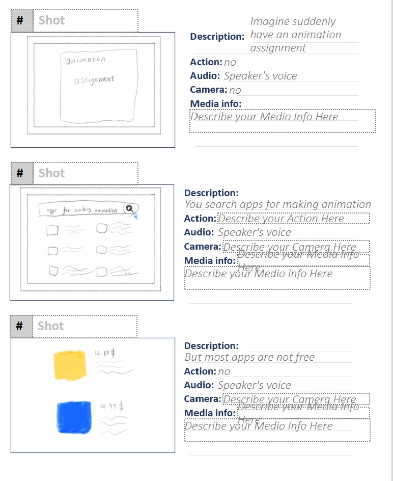
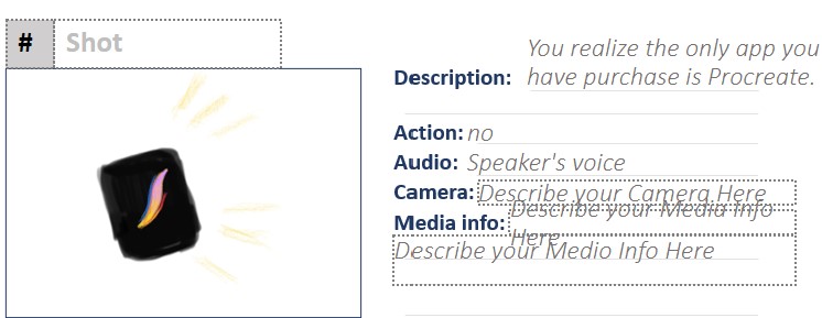
At first I decide to make a slide presentation for my module. The reason is that the presentation not only follows the design principle, but also represents the power of reducing the extraneous load (Mayer). I enjoy editing the hierarchy of texts. Then I decided to create the presentation in H5P because I thought the interactive presentation would be fun.

Theories and Principles

The most important theory I have applied in my presentation are active learning and instructional design. The traditional presentation applies a few effects for students utilizing principles, so that students would have fewer opportunities to think critically. I add a question that let learners write about their own thought of the content of this module before viewing the next slide. This method can help learners read the following slides because they would compare their answers with the content of each slide.

According to Merrill’s first principles of instruction and constructive alignment, a productive learning process should involve demonstration and application. The presentation usually represents a demonstration tool while the interactive game represents an application tool. Demonstration usually appears first, then is application. However, I switch the consequence of the interactive game and the presentation. Putting interactive games at the beginning of the presentation is letting learners create their own objectives, so that learners would create their own tips for meeting new people confidently.

Reference

Goldstein, S. B., & Keller, S. R. (2015). U.S. college students’ lay theories of culture shock. International Journal of Intercultural Relations, 47, 187–194. https://doi.org/10.1016/j.ijintrel.2015.05.010

James Greenwood (n.d.) https://www.james-greenwood.com/instructional-design/toolkit/merrill/#:~:text=The%20premise%20of%20Merrill%E2%80%99s%20first%20principles%20of%20instruction,principles%20are%20necessary%20for%20effective%20and%20efficient%20instruction.%E2%80%9D%28p44

Kushwaha, Ayushi. (2020, December 20). Want to Socialize? Here are 5 Tips for International Students. CEOWORLD magazine. https://ceoworld.biz/2020/12/18/want-to-socialize-here-are-5-tips-for-international-students/

Staff, C. P. (2009, July,17). 7 Ways to Heal Your Childhood Trauma. https://casapalmera.com/blog/7-ways-to-heal-your-childhood-trauma/

Sunshine Community Health Center (n.d.). Emotional And Psychological Trauma: What Is It and How To Heal? https://www.sunshineclinic.org/blog/emotional-and-psychological-trauma-what-is-it-and-how-to-heal/

Sunshine Community Health Center (n.d.). How Trauma and Stress as Young Children Affect Our Health as We Age? https://www.sunshineclinic.org/blog/how-do-trauma-and-stress-we-feel-as-young-children-affect-our-health-as-we-age/

University of Victoria: Educational Technology. (2022, October 7.) W6: Instructional Design and Lesson Planning. https://edtechuvic.ca/edci337/2022/10/02/w5-design-principles-for-multimedia-presentations/

Artificial Intelligence-Reflections from AI tools

This week I tried using Magic Sketch and Quick, Draw for my own interest. I discover these AI tools only recognize one category of an object. Taking an example of drawing a bridge in Magic Sketch, the system only recognizes the arched bridge. When I want to draw a suspension bridge, the system will assist me to draw an arched bridge automatically.

I’m more surprised by the Quick, Draw tool because it provides an abundance of data for each object. These data remind me the principle of “half-life” (VentureBeat, 2022) is true, which is collecting data base on the existed knowledge. I’m wondering AI tool is not precise when it was first invented, but Quick, Draw system would collect the present data from the first group of participants. Each doodle would ask the participant to finish in 16 seconds. The number of these doodles would still raising in the future. I really anticipated it.

Back to the Magic Sketch, this tool seems far away from the human brain. The evidence of how Magic Sketch collect data is still vague to me. Probably workers have assigned certain standards to this tool.

a part of the doodles that Quick, Draw has collected, I hardly find the doodle I have done before

https://www.ibm.com/blogs/systems/wp-content/uploads/2019/12/rodrigo1.png

Would AI change the creative factory?

My concern of these AI tools is they became more and more similar than human brain. The way of AI tools let participants complete tasks in a short time is similar with managing intrinsic load. And these AI tools would optimize the strategy of learning knowledge without load. However, humans have a load of learning new knowledge.

An apparent drawback of the AI tool is that this tool doesn’t have an intrinsic ability to recognize non-moral information. Luckily, humans have abilities to restrict particular phrases for the AI tool. Just like adults teach youths about moral knowledge, so that youths would remember this knowledge in their rest of their life. Therefore, AI tools would not be used in a moral way unless these tools are under human supervision.

Reference

Ceron, Rodrigo (2019), AI, Machine Learning and Deep Learning – What’s the Difference?, IBM Systems Lab

Roose, Kevin (2022, November 5), AI-generated art is already transforming creative work, Khaleej Times, https://www.khaleejtimes.com/long-reads/ai-generated-art-is-already-transforming-creative-work

VentureBeat (2022), How Duolingo is using AI to Humanize Virtual Language Lessons, accessed Nov 11, 2022

Future trends of multimedia

According to this week’s content, I have learned several trends that will affect students’ educational experience in the future.

The most interesting part for me is gamification. Even though this trend would not expand in K-12 education, gamification can support college students in solving real-life problems. These real-life problems require academic knowledge and non-academic knowledge.

Gamification and Twine

Non-academic knowledge usually refers to tips of solving problems from everyday life like dealing with stress. According to my experience of using Twine for the first time, I apply the activity of narration. This narrative activity is inspired from the exam week, which is close to most students’ current situation.

Here is an example:

sufferring from the exam week

College students are usually stuck between school and society, so it is important for them to learn some skills in mental health. In addition, this narrative activity is most suitable for the pre-training principle. The goal of applying the pre-training principle in the Twine story is to let learners familiarize their stress rate rather than previewing the definition of stress.

As for applying academic knowledge, the narrative activity is also applicable for gamification in a narrative format. The best example is a Twine project called Chinese Immigration by Emily McCue. This project involves several historical events like the gold rush. I feel a sense of engagement when I was trying this narrative game. That project is suitable for the recall of all knowledge from the course compare to my project. If not, learners would forget all these contents in a few days.

In conclusion, Twine can collect academic knowledge and non-academic knowledge for college students. However, the way of organizing both types of Twine projects is considerable.

Reference

McCue, Emily, Chinese Immigration: a student project using Twine, https://emilymccue.ca/immigration/, accessed Nov 20, 2022.

Active Learning

Historia is a game-based learning system. Students would learn actively through group discussion. This learning strategy guides students to research history by themselves rather than learning from the instructor.

There are two systems of active learning. One is student-centered learning (UDL) while another is problem-based learning (Merrill’s First Principles of Instruction)(University of Victoria: Educational Technology.). This learning system has satisfied both systems, but Historia focuses on student-centered learning because students from this video reply they have positive experiences from the learning.

According to several scenes from this video, I notice the material students have used needs to be improved. Students usually research history from books. I also notice a scene in that students are using computers, which seems like students are using computers to search for information for their historical research project. However, there is no fact to show whether using a computer is students’ main method of researching historical knowledge. The most apparent problem that should have further improvement is the organization of group members. I notice each student has a fill-in-blank handout for group discussion. Other group members might unable to view written responses from each other.

Multimedia tools that can access more than one would improve the action of group assembly. Taking the example of Mattermost, group members could discuss their opinions of the research topic. This tool is best for reporting the status of group members. For example, if a group member would not attend the meeting due to family issues, they can comment in the group chat.

Planning the content for the project is also essential in the history assignment. Multimedia tools for conceptual mapping would help with that. Students would share the information from their research in a template, so that group members would see them.

Reference

University of Victoria: Educational Technology. (2022, October 29.) W9: Active and Passive Learning. https://edtechuvic.ca/edci337/2022/10/29/w9-active-and-passive-learning/

The New Form of the Course Outline : Core Multimedia Skills

Planning the course is an essential step in instructional design. An excellent course outline should guide learners on what will they learn in this course. In addition, I have thought of applying the planning template to the infographic. The infographic can describe the information with texts and images, which makes readers make sense of the information easily. My goal for writing the outline in an infographic format is to let learners find an easier way to read the course outline.

Firstly, I prepare the content in the initial planning template to decide which content I need to put for my infographic. The title of this course is called “POTTERY TECHNIQUE”, which is inspired by the infographic of clay description (Fig 2). Secondly, I arrange the content from the initial planning template. The change I have made in my updated infographic (Fig 1) is that I arrange the title in the center of the infographic. The goal is that I want to create a unique attraction for viewers to notice the title. In addition, the alignment for the title is on the right while the alignment of the rest of the content is on the left, so that viewers would distinguish the title easily.

figure 1: my updated infographic
figure 2: the infographic I have done in EDCI 337
figure 3. numbers represent the sequence of the content of the infographic

Compared with the first version of the infographic (Fig 2), there is no image in my updated infographic. The reason is that my goal is to help learners read text easily rather than making a fancy infographic (Mayer). Even though some infographics are created by texts as well, planning the hierarchy should consider both the coherence principle (Mayer) and basic design principles.

The text is my main feature in the infographic. I play the text with the size and the font to create the hierarchy of each factor from the course outline. I set the subtitle “BIG IDEA” in the largest size because this is the first information learners should know from the course content. The sequence of reading the original infographic (fig 2) in a downward sequence. My new infographic has a random seuqence. Readers would figure out the sequence by the size of the subtitle. A subtitle in the largest size usually first noticed by readers (fig 3).

Besides, I highlight some phrases from the infographic. This technique helps learners discover their goals for this course easily. This technique is inspired from the signaling principle of the multimedia learning principle (Mayer). Phrases such as “weather condition” and “cultural background” are further explorations of this course, these phrases also link to “critical thinking”, so that I highlight these phrases. The reason of not highlighting these phrase in the course outline handout is because the colour contrast is more attarctive than the balck and white.

In conclusion, I combine all the basic design principles and several multimedia learning principles in the infographic. Learners would remind the information from the infographic rather than the simple course outline handout.

Reference

Adobe Express. (2020, October 17.) 8 basic design principles to help you make awesome graphics. https://www.adobe.com/express/learn/blog/8-basic-design-principles-to-help-you-create-better-graphics

James Greenwood (n.d.) https://www.james-greenwood.com/instructional-design/toolkit/merrill/#:~:text=The%20premise%20of%20Merrill%E2%80%99s%20first%20principles%20of%20instruction,principles%20are%20necessary%20for%20effective%20and%20efficient%20instruction.%E2%80%9D%28p44%29

Learning House. (2019, March.) Multimedia Learning Principles. https://ctl.wiley.com/wp-content/uploads/2016/07/MultimediaPrinciples_Summary.pdf

University of Victoria: Educational Technology. (2022, October 2.) W5: Design Principles for Multimedia Presentations. https://edtechuvic.ca/edci337/2022/10/02/w5-design-principles-for-multimedia-presentations/

Storytelling with Video

provided by unsplash

According to Rich McCue’s two versions of storytelling. The audio just describes the 3-2-1 backup plan briefly, and mentioned the story of a student who lost her laptop during the fire accident. This audio gives me an auditory sense but no visual sense, which enhances my working memory (Brame, 2015). For one thing, this audio recording is useless for audience engagement. For another, recording audio clips have a similar function to storyboarding. Audio recording can highlight the thesis of the story.

The video version extends the real-life story from the audio version. This time McCue has used the first person to introduce this story. McCue describes why that student’s laptop is destroyed as well as further details of the fire. Images that link to the story give me a strong visual effect. Then the rest of the video McCue concludes the importance of the backup plan.

McCue’s storytelling of the 3-2-1 backup plan has satisfied all of Mayer’s multimedia learning principles. However, the most apparent principle is the pre-training principle. Even though the audio recording has mentioned the backup plan, it gives context before audiences watch the video.

In addition, this storytelling regardless of action learning both in Universal Design for Learning (UDL) and Merrill’s principles. Both video and audio focus on describing the real-life story (Merrill), but there’s no further step in using the 3-2-1 backup plan. According to McCue’s objectives for storytelling, both video and audio do not meet these objectives. For example, where could people find suitable storage is not mentioned.

this is my script for the video in learning purpose

I refine my script by adding several personal experiences. This storyboard shows what scenes I would show to audiences.

Reference

Brame, C.J. (2015). Effective educational videos. Retrieved [todaysdate] from http://cft.vanderbilt.edu/guides-sub-pages/effective-educational-videos/.

James Greenwood (n.d.) https://www.james-greenwood.com/instructional-design/toolkit/merrill/#:~:text=The%20premise%20of%20Merrill%E2%80%99s%20first%20principles%20of%20instruction,principles%20are%20necessary%20for%20effective%20and%20efficient%20instruction.%E2%80%9D%28p44%29

comment for Justine

Hello Justine,

Thanks for showing this fabulous sketchnote. It is very straightforward to understand these service steps, even though I haven never known the detail of serving.

As for your concern of dealing with the redundancy principle. I have the same problem as you. However, I have a few steps that might help you improve your redundancy principle. When listening audio, trying to catch main texts from the speaker, and write down the time when this text appears, so that you can review thhis infomation by this specific time.

For example, when I was listening to the Soundcloud about Multimedia Learning, I heard the information of “….base on retention” and “how it is measured?”. Then I wrote down “How it is measured? based on retention.” The point is you don’t need to care about grammar when taking notes. All we need to do is learn knowledge as efficiently as possible.

Angel

About Design Principles

The theme for this week I learn design principles, which I’m so excited about it. Even though I have learnt design principles before, this is the first time I can create my own design after I have studied design principles right away.

My favourite part of this week’s course content is creating an infographic. It reminds my experience of watching fabulous infographics on Pinterest. These infographics not only involve plenty of aesthetic skills, but also describe a theme from new angles. I was wondering when could I create these creative infographics.

BUT NOW I CAN DO IT

This is an infographic from one of my art history course

Visual Effects

I create the first infographic from one of my art history course, which is introduction of clay. I choose the template that is the most suitable for my theme after I write down my required texts. I design this infographic by following the colour principle and hierarchy principle.

There are two main colours in this template, so I use these colours for my texts as well. However, I add two analogous colours. I discovered this technique when aligning texts from “COLLECTING CLAY”, this light-pink colour as normal texts looks too contrasting, so I desaturate the colour of these normal texts for highlighting the subtitle. I also change the colour of numbers in jade-green, which is the analogous colour of green. Then I put each number behind each step, so that this procedure would look more creative.

Besides, I view the infographic one more time and discover texts from “COLLECTING CLAY” look unattractive, so I change these texts in the upper case to make them readable. In addition, I find a creative tip for making texts in a hierarchy by the graphic of a river. This tip is inspired by the first step “Collecting the clay near the river or lake”, so that I decided to put this graphic as a tool for introducing something. The rhythm of the river flowing to the end of the infographic leads audiences to read the procedure of collecting clay.

Blog Post #3: Comments for Chuhesong

Hi Chuhesong,

Your description of segmenting principle is very creative. You illustrate the knowledge we have received as a big bomb, which I agree with you.

Besides, have you ever thought about reorganizing bite-sized information into more than one form? For example, you create an instructional video of how to cut a sphere. And you define four steps of cutting a sphere:

  1. put out a knife
  2. draw the center line on the sphere
  3. cut the sphere through the center line
  4. cut the rest of the sphere into the shape of whatever you like

You would find these steps are not straightforward after a few days. Then you can define the instruction of cutting a sphere into other instructions such as how to cut a sphere into stars; how to cut a sphere into squares, etc.

That’s all my assumptions. Hope you could enjoy them.

Angel

We are NOT STUPID—the Reflection of Universal Design for Learning Guidelines

The story started…

In a computer class, the teacher taught us to make a website, and this assignment had a final critique. First, the teacher demonstrated how to design the webpage, then she let us do this step by ourselves. However, every classmate finished making the webpage except me because I had some technical issues. Next, I was unable to reach the next step which the teacher started talking about it. Since then, I felt awkward in the computer class and didn’t attend the critique.

provided by Pixabay

Studying is our own business

Since I have learnt the UDL (Universal Design for Learning), I discover the weakest part of Chinese teaching from the UDL is Action & Expression. Teachers in China would show PowerPoint that involves various images and texts in class. They would describe the content per slide as well. However, students wouldn’t have another chance to look back at the PowerPoint one more time. This teaching strategy might test each student’s learning ability, but a few students still need more than one time to understand the knowledge, so students who would not make sense of this teaching would be defined as “stupid” students.

provided by Pixabay

Possible ways to relieve this situation

There are two ways to relieve this situation: visual and physical. Both ways must be accessible and not conflict with each other. Showing students pre-recorded videos is the best way to help students refresh their knowledge visually. Pre-recorded videos are suitable for almost all subjects such as Mathematics, Chinese, and Physics. However, these videos should contain detailed contents and prevent funny components. Students already know the overview of this knowledge, so their present goal is to reinforce this knowledge. For example, if a student has trouble with composing an English sentence. A video that involves detailed steps on how to compose a perfect English sentence is suitable for this student.

Next is the physical part, students can reinforce their knowledge by doing more exercise after watching the instructional video. Students can do exercises both on paper and online. According to the learning situation in China, doing exercises online is the best method for students. Online tests and online exercises produce less pressure from classmates than paper exercises. Besides, online exercises have more privacy than paper exercises. My classmates used to mark math exercises with each other according to my experience. I was thinking everyone’s ability would be exposed, which I felt very uncomfortable.


« Older posts

© 2025 my EDCI 337 blog

Theme by Anders NorenUp ↑