Planning the course is an essential step in instructional design. An excellent course outline should guide learners on what will they learn in this course. In addition, I have thought of applying the planning template to the infographic. The infographic can describe the information with texts and images, which makes readers make sense of the information easily. My goal for writing the outline in an infographic format is to let learners find an easier way to read the course outline.
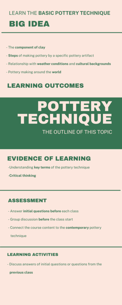
Firstly, I prepare the content in the initial planning template to decide which content I need to put for my infographic. The title of this course is called “POTTERY TECHNIQUE”, which is inspired by the infographic of clay description (Fig 2). Secondly, I arrange the content from the initial planning template. The change I have made in my updated infographic (Fig 1) is that I arrange the title in the center of the infographic. The goal is that I want to create a unique attraction for viewers to notice the title. In addition, the alignment for the title is on the right while the alignment of the rest of the content is on the left, so that viewers would distinguish the title easily.
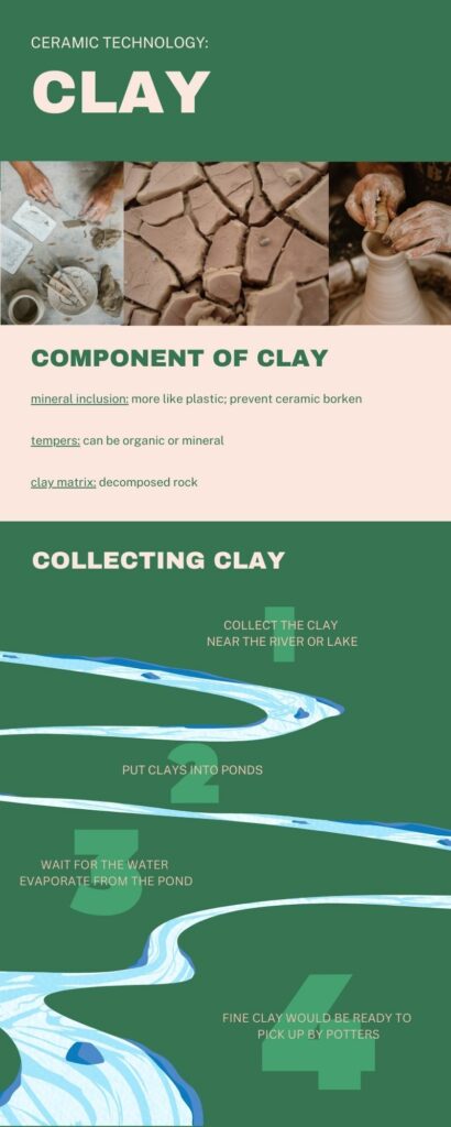
Compared with the first version of the infographic (Fig 2), there is no image in my updated infographic. The reason is that my goal is to help learners read text easily rather than making a fancy infographic (Mayer). Even though some infographics are created by texts as well, planning the hierarchy should consider both the coherence principle (Mayer) and basic design principles.
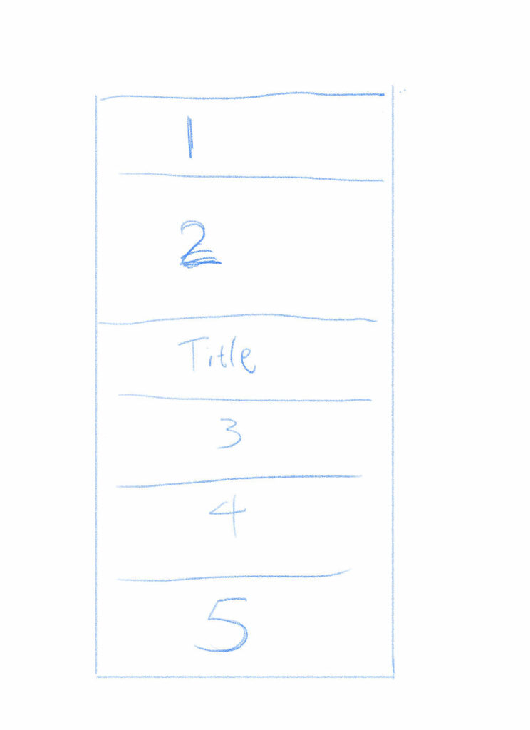
The text is my main feature in the infographic. I play the text with the size and the font to create the hierarchy of each factor from the course outline. I set the subtitle “BIG IDEA” in the largest size because this is the first information learners should know from the course content. The sequence of reading the original infographic (fig 2) in a downward sequence. My new infographic has a random seuqence. Readers would figure out the sequence by the size of the subtitle. A subtitle in the largest size usually first noticed by readers (fig 3).
Besides, I highlight some phrases from the infographic. This technique helps learners discover their goals for this course easily. This technique is inspired from the signaling principle of the multimedia learning principle (Mayer). Phrases such as “weather condition” and “cultural background” are further explorations of this course, these phrases also link to “critical thinking”, so that I highlight these phrases. The reason of not highlighting these phrase in the course outline handout is because the colour contrast is more attarctive than the balck and white.
In conclusion, I combine all the basic design principles and several multimedia learning principles in the infographic. Learners would remind the information from the infographic rather than the simple course outline handout.
Reference
Adobe Express. (2020, October 17.) 8 basic design principles to help you make awesome graphics. https://www.adobe.com/express/learn/blog/8-basic-design-principles-to-help-you-create-better-graphics
James Greenwood (n.d.) https://www.james-greenwood.com/instructional-design/toolkit/merrill/#:~:text=The%20premise%20of%20Merrill%E2%80%99s%20first%20principles%20of%20instruction,principles%20are%20necessary%20for%20effective%20and%20efficient%20instruction.%E2%80%9D%28p44%29
Learning House. (2019, March.) Multimedia Learning Principles. https://ctl.wiley.com/wp-content/uploads/2016/07/MultimediaPrinciples_Summary.pdf
University of Victoria: Educational Technology. (2022, October 2.) W5: Design Principles for Multimedia Presentations. https://edtechuvic.ca/edci337/2022/10/02/w5-design-principles-for-multimedia-presentations/
Leave a Reply
You must be logged in to post a comment.